Beauty Tips FREE Professional Courses
The coloring wheel | ADVANCED nail art TIPS 101
Colour theory is the science and art of using colour to explain how people perceive colour; how colours are mixed or contrasted with each other and basic rules and guidelines for colour and its use to create aesthetically pleasing visuals.
This is a logical colour structure to create and use palettes more strategically using an advanced nail art tool called the coloring wheel.
That result means to evoke a certain emotion, atmosphere or aesthetic. In colour theory, colours are shown on the coloring wheel and grouped into 3 categories: primary colour, secondary colour, and tertiary colour.
Beauty Tips FREE Professional Courses

The coloring wheel – Why should you use colour theory?
Colour theory can help you build your nail brand and also influence your nail art sales. It is important to understand this as a technician, nail artist or salon owner. Colour is a concept, a perception, a representation and more than just a visual expression.
People decide whether they want a product or not in 1.5 minutes or less. 90% of this decision is based solely on visual representation. Our eyes absorb light and data is sent from our eyes to our brain. Objects reflect light in different accumulations at different wavelengths. Our brain takes different wavelengths and converts them into an event we call colour, the colorign wheel is an attempt to encapsulate this complex concept.
Understanding the colour wheel and colour harmonies (what works, what doesn’t and how they communicate) is equally exciting. Colour theory is a practical combination, a detailed study of the art and science used to determine which colours look good together, how we achieve a particular colour.
In 1666, Sir Isaac Newton invented the colour wheel and mapped the colour spectrum. This is the basis of colour theory because it shows the relationship between colours and how they react to each other.
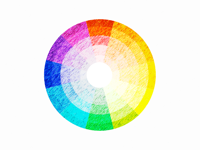
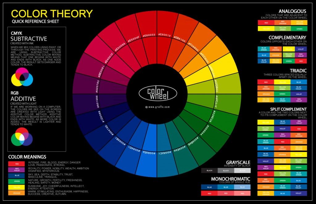
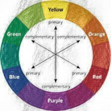
The coloring wheel consists of three primary colours (red, yellow, blue), three secondary colours (green, orange, purple) and six primary tertiary colours.
The colouring wheel what are primary colours?
When mixing colours for painting your nail art, the rule is that three colours cannot be made by mixing other colours one way or another. These three colours, red, blue, and yellow, are known as the primary colours. This is the basis of the colour wheel and all other colours are created by mixing them in different proportions. The coloring wheel represents primary colours as its pillars, think of them as like the head item in a drop-down menu, with many, almost infinite shades and combinations under them.

How to create secondary colours using a primary colour:
Secondary colours are obtained by mixing two primary colours. I.e. To get purple: red + blue and orange: red + yellow and of course green is blue + yellow!
If we mix all three primary colours, we get black. When mixing colours, the most important thing is to choose the base colours. There are different shades of red, yellow, and blue, which when combined also result in different secondary colours, giving a different coloring wheel each time.
How can you create tertiary colours using primary and secondary colours?
Tertiary colours are created by mixing two adjacent colours on the colour wheel into primary and secondary colours. These colours are also called fractional colours, intermediate colours, because they are not as bright and distinct and abundant in the primary and secondary colours.
Because these colours are often found in nature, tertiary colours are very important for natural images. Examples of tertiary colours as transition colours in a blending table: Yellow + orange = yellow-orange; orange + red is red-orange etc…
There is a fourth level of colour mixing that rarely appears on the regular colour wheel. When two tertiary colours are mixed, quaternary colours are formed. These colours are the most complex, interesting of all and add depth, subtlety and oomph factor to painting colour schemes. As we said the coloring wheel is the artists best friend when looking to create new and vivid nail art.
The coloring wheel – understanding the tone:
The tone changes from light to dark when you look at the black and white range of a particular colour. Seeing the tonal levels when looking at a colour takes more practice and is just as important to check. It is best to limit the number of colours used when mixing until you feel complete control over the tone.
The coloring wheel – warm and cool colours:
The warmth or coolness of a colour is also known as colour temperature. The combinations shown on the coloring wheel usually have a balance of warm and cool colours. Each colour also has cool or warm variations. Different colours can be achieved by mixing cool or warm versions of colours.
For example, a cool red mixed with a warm yellow is different from a cool red mixed with a cool yellow and vice versa. And because we have a wide range of cool and warm variations, the list of colours that can be mixed and achieved is endless.
On the coloring wheel, warm colours from red to orange to yellow are like the colours of the sun. Cool colours are colours from blue to green to purple, like natural water or sky tones. It is important to note that individual colours tend towards cool and warm colours based on their undertones.
When you mix these two types of warmth, you get a warm secondary colour, and conversely, when you mix these two colours, you get a cool secondary colour. For example, mixing cadmium yellow and cadmium red light produces a warm orange.
The Coloring Wheel: Colour harmony:
Colours that work well together are called harmonious colours. Nail artists and technicians use these colour moods to create a particular look or feel.
I recommend using the colour wheel to find colour harmonies, mix colours to achieve new colours, and understand how you can create many different colours in addition to primary, secondary, and tertiary colours. Harmony ensures dynamic balance.
The coloring wheel – monochrome colours:
This is when different hues, tones, and shades are added to a colour by adding white, black, or grey to the base colour.

Coloring wheel – complementary colours:
These are two colours that are on opposite sides of the coloring wheel. This combination provides high contrast and attracts the human eye, making it appear brighter and more expressive, complementary colours can be described as harmonious, but not all harmonious colours are complementary.
For each of the three secondary colours, the complementary colour is a primary colour that is not used in the creation.
Analogue colour scheme:
The three colours located on the side of the colour wheel are called analogue. This colour combination is very versatile and creates beautiful nail art. To balance the same colour scheme, pick 1 dominant colour and use the others as compliments or accents.
Triadic colour scheme:
Three colours that are equidistant on the colour wheel are called triadic. Which gives a high difference colour scheme, but less contrasting compared to complementary colours.
Finally the tetradic colour scheme:
Four colours that are equidistant on the colour wheel. Tetradic colour schemes are bold and best if you let one colour dominate and use the others as additional accents.
The Psychology of Color:
Color is a powerful and important part of the human experience. It has the power to evoke emotions, set moods, and even influence our behavior. Color is an integral part of design, branding, and marketing, but it can also be used in other ways to create a more harmonious environment.
The psychology of color has been studied extensively over the past century by researchers in many fields. This article will provide a basic introduction to some of the major findings from this research on how color affects our lives.
The psychology of color is an important aspect of design because it has the ability to influence how people feel and act.
Color can be used to convey a message, create a mood, or symbolize an object. The psychology of color is so powerful that it can even change the way we think about ourselves and others.
Additional References & Tools:
FREE CPD ACTIVITY
Do you want access to free CPD activities and certificates?
Why not try one of our nail technician courses now available throughout the UK, enquire today for FREE introductory course
“A poor artist just paints, a good artist inspires” – beauty-tips.co.uk
Beauty Tips FREE Professional Courses
